
START WITH WHAT’S REAL
✳Make room for the whole picture.
Design, research, piano, and photography each have their own space, so visitors can follow what interests them without losing the sense that it all belongs to one person.
 Al Sammarraie
A personal website for bringing my design and development work together with research, music, photography, and the interests that shape me.
FOLLOW THE PROCESS↓THE IDEA
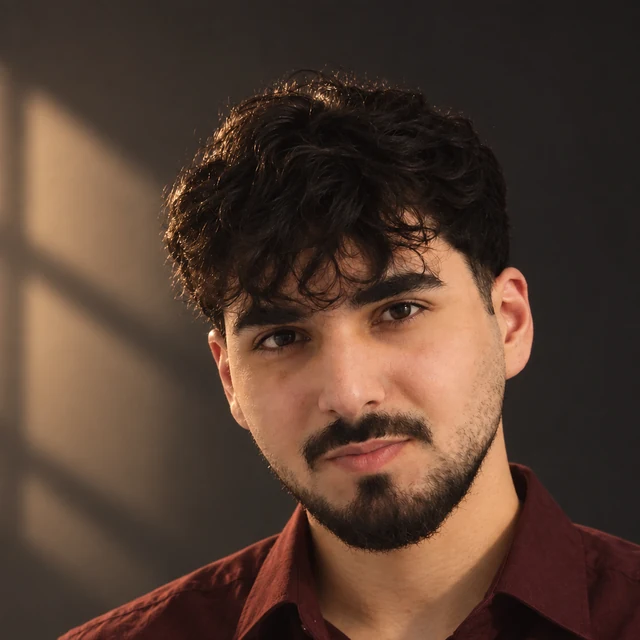
I’m Noor, a designer and developer. I wanted the site to feel like a small portrait of me: what I make, what I explore, and what I enjoy away from work.
That meant bringing web and visual design, economics and statistics, piano, and photography into one experience. Each part needed room to be itself while still feeling like it belonged to the same person.
Bring my interests into one place while keeping each part clear, considered, and unmistakably mine.
HOW IT TOOK SHAPE
The website grew by connecting its content, visual language, navigation, and small interactive details into one system.
Design, research, piano, and photography each have their own space, so visitors can follow what interests them without losing the sense that it all belongs to one person.
Deep green-black surfaces, warm paper tones, wine-red highlights, and teal accents give the pages a shared visual rhythm. Oversized serif headings bring character; compact labels keep the interface precise.
The side navigation stays familiar as the pages change. Sections, cards, and small labels help people understand where they are and where a link will take them.
Hover states, motion, the piano-note visualizer, and photography give the experience energy while keeping the content easy to read.
A FUN FACT
I made this site speak the three languages I speak: English, Romanian, and Arabic.
Switch to Arabic and the layout reads right to left.THE DESIGN LANGUAGE
Ink and soft charcoal make a quiet base. Paper, wine, and teal add contrast and identity.
Roboto Slab gives headings their editorial weight. Barlow Condensed keeps body copy direct; IBM Plex Mono adds crisp labels and navigation.
Fine rules, offset color blocks, grain, geometric backdrops, and deliberate spacing make the system feel connected without flattening every page into the same layout.
THE SITE, PAGE BY PAGE
Each page follows its own subject, while the shared navigation and design details tie the experience together.
A SITE THAT KEEPS GROWING
This is my portfolio, my archive, and a place to keep making things. I hope something here gives you an idea of your own.